
W E B S I T E S T R A T E G Y
Starting a Conversation
Whether I’m leading a redesign, rethinking a user journey, or cleaning up content chaos, I bring people together around a common digital language—one that’s honest, intuitive, and impossible to ignore. By emphasizing simplicity and authenticity, I help institutions tell their stories in ways that engage, inform, and invite meaningful connections.
KNOW YOUR AUDIENCE
At W&L, I led web strategy during a time of digital transformation—overseeing the implementation of a new student-focused direction for wlu.edu.

Highlights
CMS change to drive efficiencies in design and development
Streamlined navigation for better UX
Consistent branding across channels to support a cohesive narrative
Enhanced accessibility and virtual features to expand reach
Implementation of sustainable and scalable governance practices
By prioritizing our primary audience we created a website that felt more like a personal conversation.
I introduced user-first navigation, accessibility compliance, and a more inclusive tone of voice—unifying web, print, and social media to reflect the institution’s core values and vision.
From stakeholder engagement to content governance, I ensured that every click reinforced trust and transparency.
DIVIDE AND CONQUER
VMI’s existing site was more artifact than asset—outdated tech, fragmented content, and a structure that left users guessing.
Working to improve the performance of the site and build stronger connections with our diverse audiences, we divided the singluar catch-all website into three platforms to serve VMI’s distinct audiences.
-

vmi.edu
External audiences and public storytelling
-

InsideVMI.edu
Prospective cadets and families
-

MyVMI.edu
Internal audiences, tools, and resources
Key Results
Prospective students found the right information faster. Internal users had a dedicated environment for their resources.
VMI’s external community was informed about events and activities.
And the website(s) finally had room to breathe, while focusing intentionally on users for more personalized experiences.
Which ultimately boosted positive engagement, increased application yield, and reduced attrition.
COHESIVE STORYTELLING
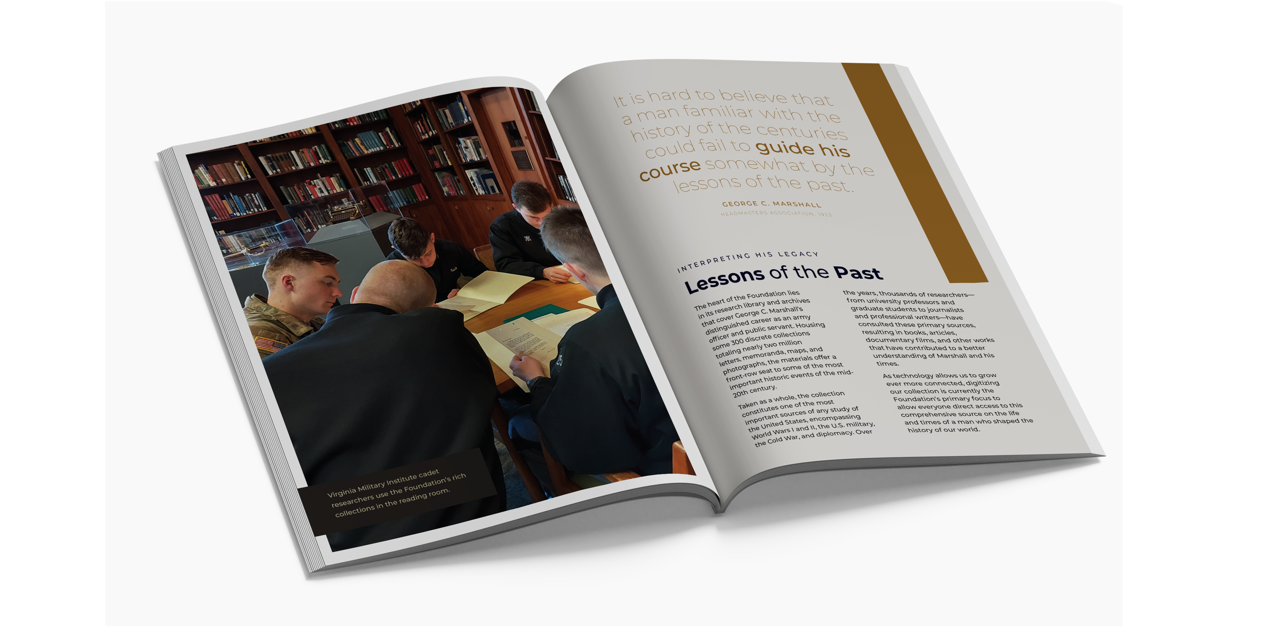
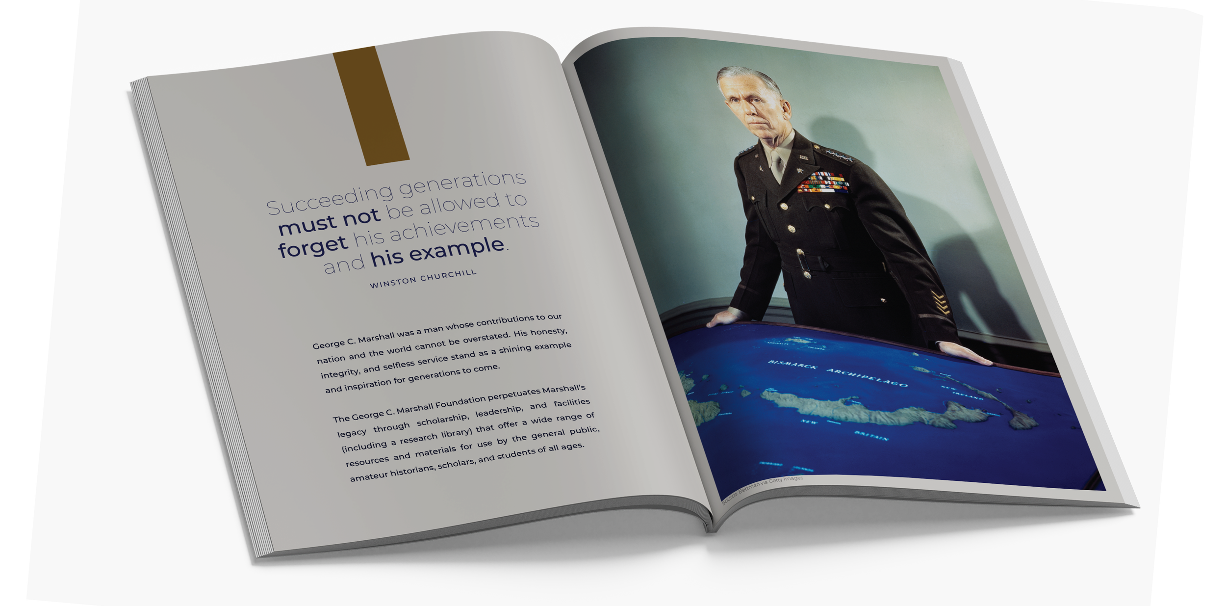
As the George C. Marshall Museum shifted from a physical space to a fully digital presence, I helped craft a strategy that honored its legacy while embracing the future.


Outcomes
I ensured the Foundation’s digital presence not only shared Marshall’s story—it sparked a ongoing engagement among researchers and donors.
The result was a redesigned website that was user-friendly, visually compelling, and accessible to global audiences. Additionally, I created a lookbook—a storytelling tool that inspired donors and drove continued investment in the Foundation’s initiatives.
We didn’t just build a website; we built a platform that continues to engage audiences, honor Marshall’s legacy, and deepen donor relationships—all of which set the stage for long-term growth and digital innovation.
MY A P P R O A C H
Connecting the Dots
Across these projects, the thread that connects them is a focus on creating meaningful connections. Whether it’s ensuring an institution’s values are meaningfully reflected or turning outdated technology into a modern, user-friendly platform, I approach every project with a focus on strategy, simplicity, and storytelling.
It’s not just about having a website; it’s about making that website work harder, smarter, and more authentically for the people who visit it. And that’s what I do—one website, one conversation at a time.